Subhu Mehalingam
Subhu Mehalingam
Subhu Mehalingam
Design System for Toothsi
Research, design, management & documentation of the design system built from scratch
Research, design, management & documentation of the design system built from scratch
MY ROLE
MY ROLE
Design System Manager
Design System Manager
TOOLS
TOOLS
Figma, Miro, Jira, Confluence
Figma, Miro, Jira, Confluence
TIMELINE
TIMELINE
5 months (Apr - Aug 2022)
5 months (Apr - Aug 2022)
Challenge
Challenge
Challenge
During my time as a Product Designer at Toothsi, I was tasked with building the design system. The lack of structure and documentation led to delayed timelines and confusion.
During my time as a Product Designer at Toothsi, I was tasked with building the design system. The lack of structure and documentation led to delayed timelines and confusion.
Results
Results
Results
We implemented a systematic approach by leveraging Atomic Design principles by Brad Frost, emphasizing modularity, scalability, and consistency.
We implemented a systematic approach by leveraging Atomic Design principles by Brad Frost, emphasizing modularity, scalability, and consistency.
First Step: a Visual Audit
I started by systematically reviewing and evaluating the current visual identity to inform recommendations and action items for the design system
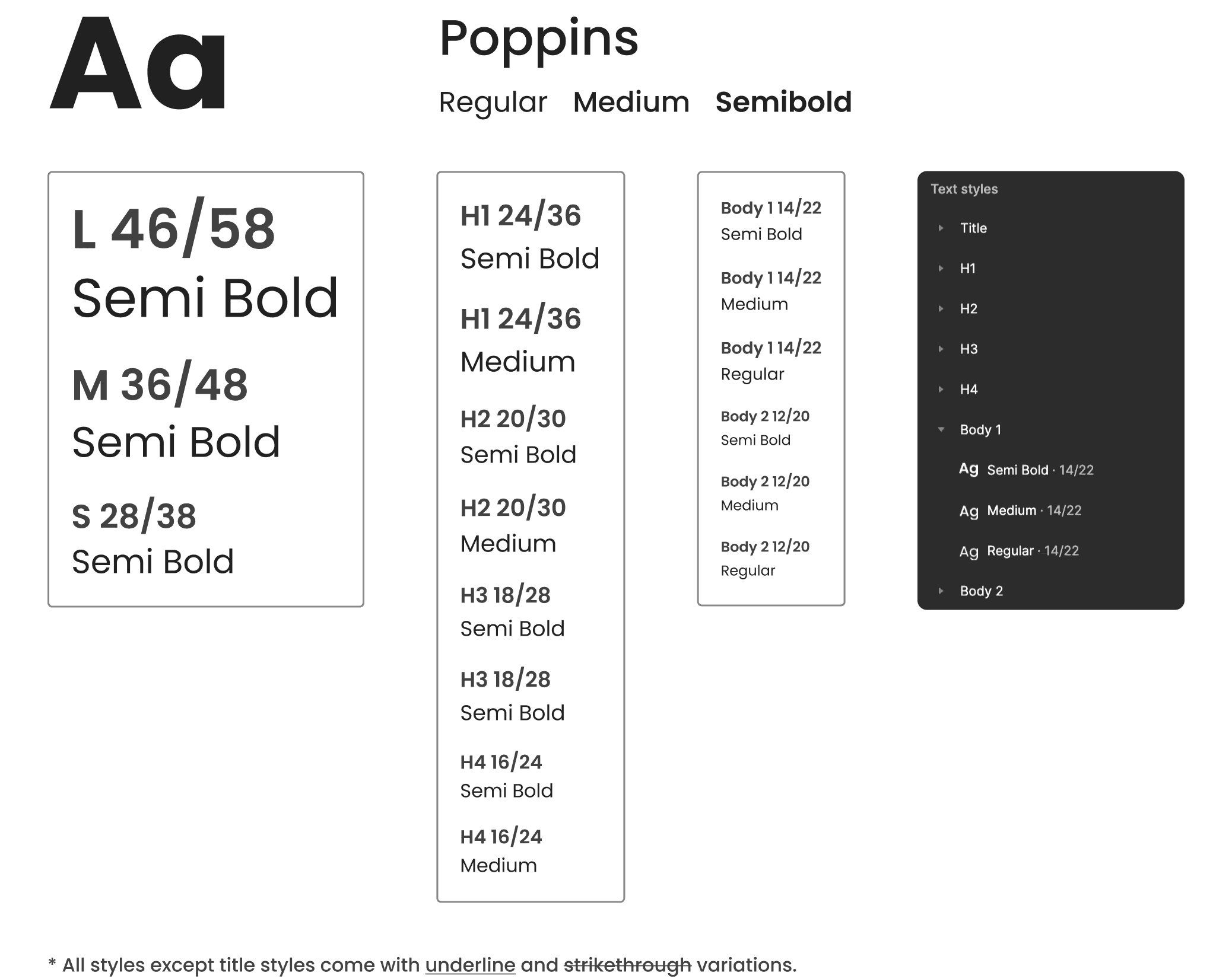
Inconsistent Type Styles
Inconsistent Type Styles
Type styles such as cases, sizes, weights, etc, were inconsistent across screens
Type styles such as cases, sizes, weights, etc, were inconsistent across screens
Inconsistent Icon Styles
Inconsistent Icon Styles
Icons were inconsistent, some were filled and some outlined, and different sizes
Icons were inconsistent, some were filled and some outlined, and different sizes
Inconsistent Components
Inconsistent Components
Design components, especially some of the key components, like CTAs, were inconsistent
Design components, especially some of the key components, like CTAs, were inconsistent
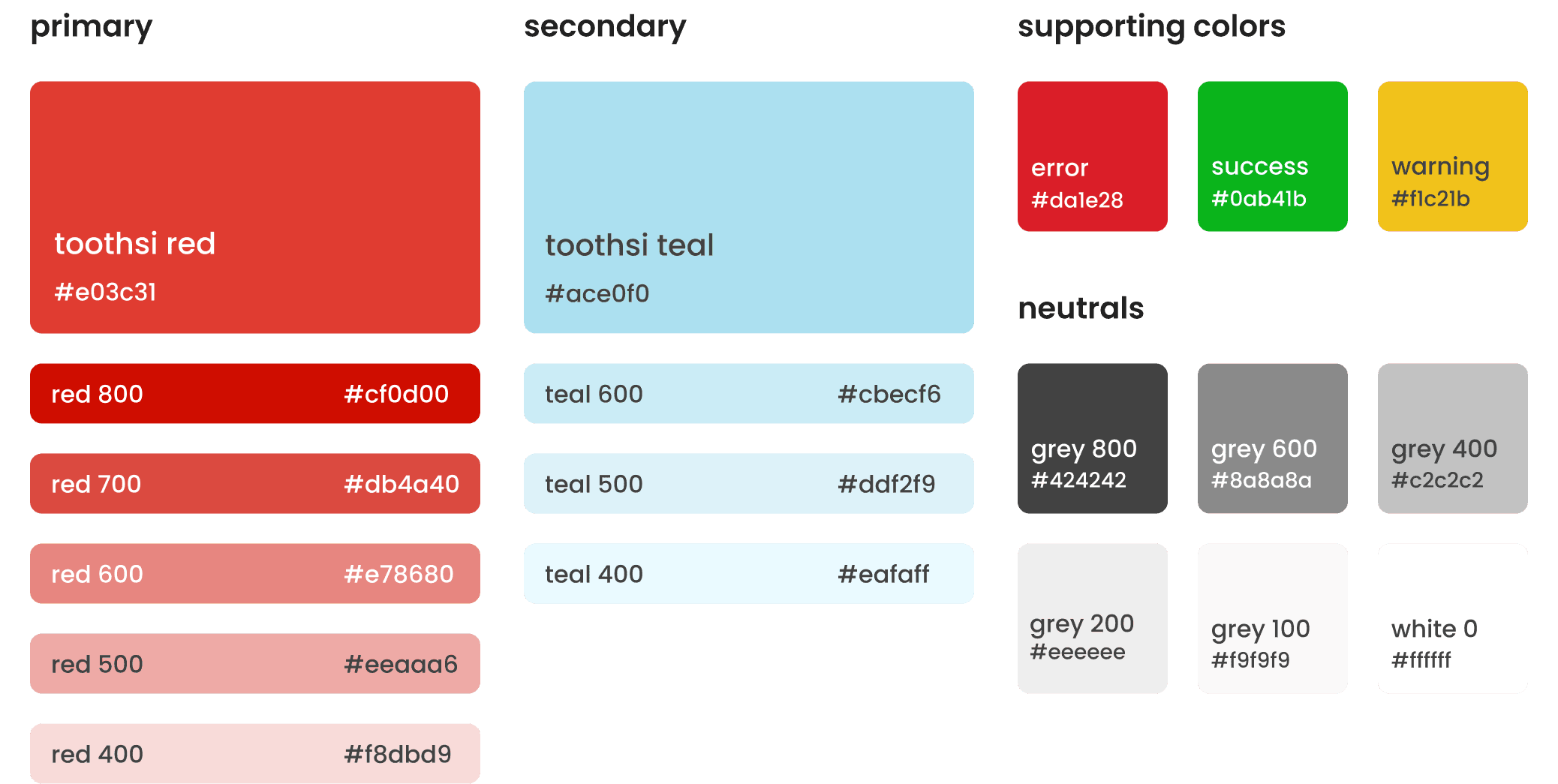
Red as Primary Brand Color
Red as Primary Brand Color
The use of red as the primary brand color posed a major challenge: How do we differentiate between default states of elements vs. error states
The use of red as the primary brand color posed a major challenge: How do we differentiate between default states of elements vs. error states
The use of a secondary color
The use of a secondary color
A secondary color, teal, is used to strike a good balance and create enough visual contrast with the primary brand color, red
A secondary color, teal, is used to strike a good balance and create enough visual contrast with the primary brand color, red
Keeping the usage minimal
Keeping the usage minimal
The use of the primary brand color is reserved for the most important elements like primary CTAs
The use of the primary brand color is reserved for the most important elements like primary CTAs
Accentuating error states
Accentuating error states
Error states are differentiated from default states by using a different hue of red, and by adding visual cues (icons) to capture the user’s attention
Error states are differentiated from default states by using a different hue of red, and by adding visual cues (icons) to capture the user’s attention
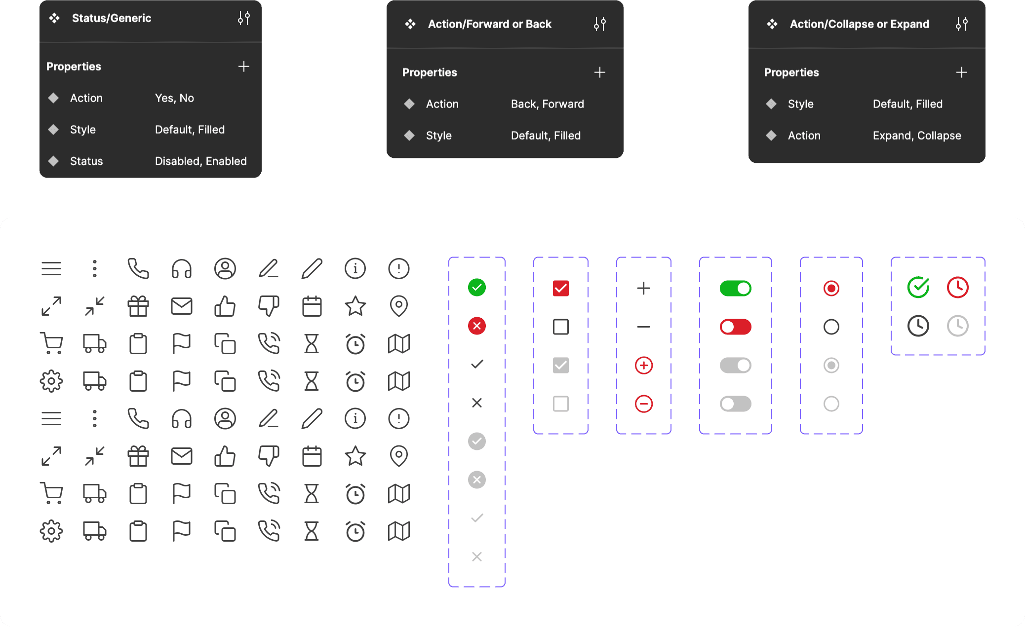
Outlined Icons
Outlined Icons
The visual audit revealed the inconsistencies in icon styles, particularly filled vs. outlined icons and their sizing. After meticulous deliberation, we chose the outlined icons style for our design system.
They look minimal, modern and light: this was especially important due to our heavyweight primary brand color, red.
They are scalable: they include more negative space and are more legible at smaller sizes
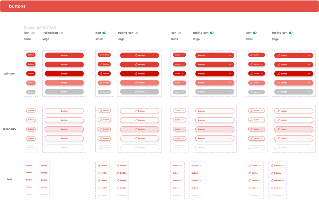
Rounded Edges over Sharp Edges
Rounded Edges over Sharp Edges
Rounded Edges over Sharp Edges
Another major inconsistency we uncovered was button styles, specifically rounded vs. sharp edges. We chose rounded edges for buttons as well as other design components:
They look friendly and approachable: rounded edges are softer in appearance
They are easier to touch (click): they are better targets for users to press
They look modern and trendy: Used across iOS and Android, they are the new industry standard
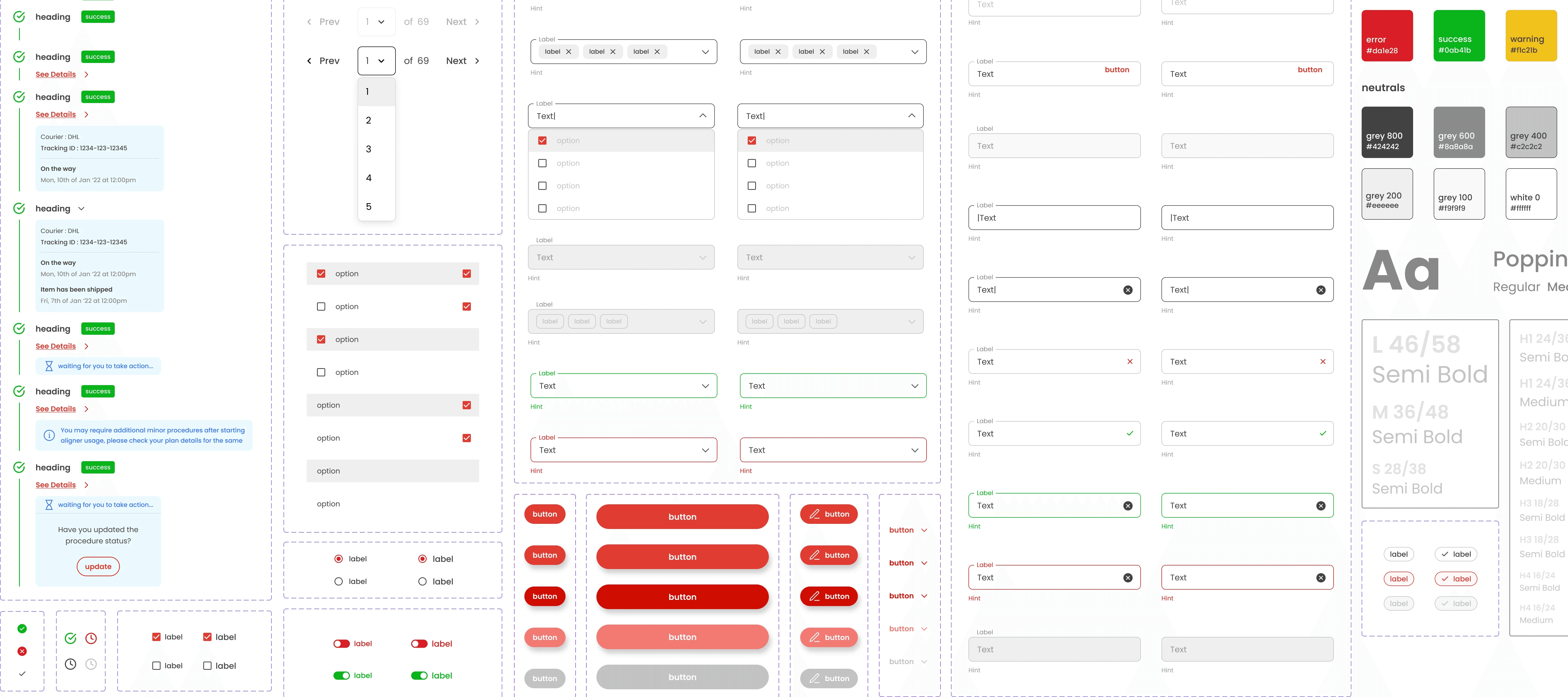
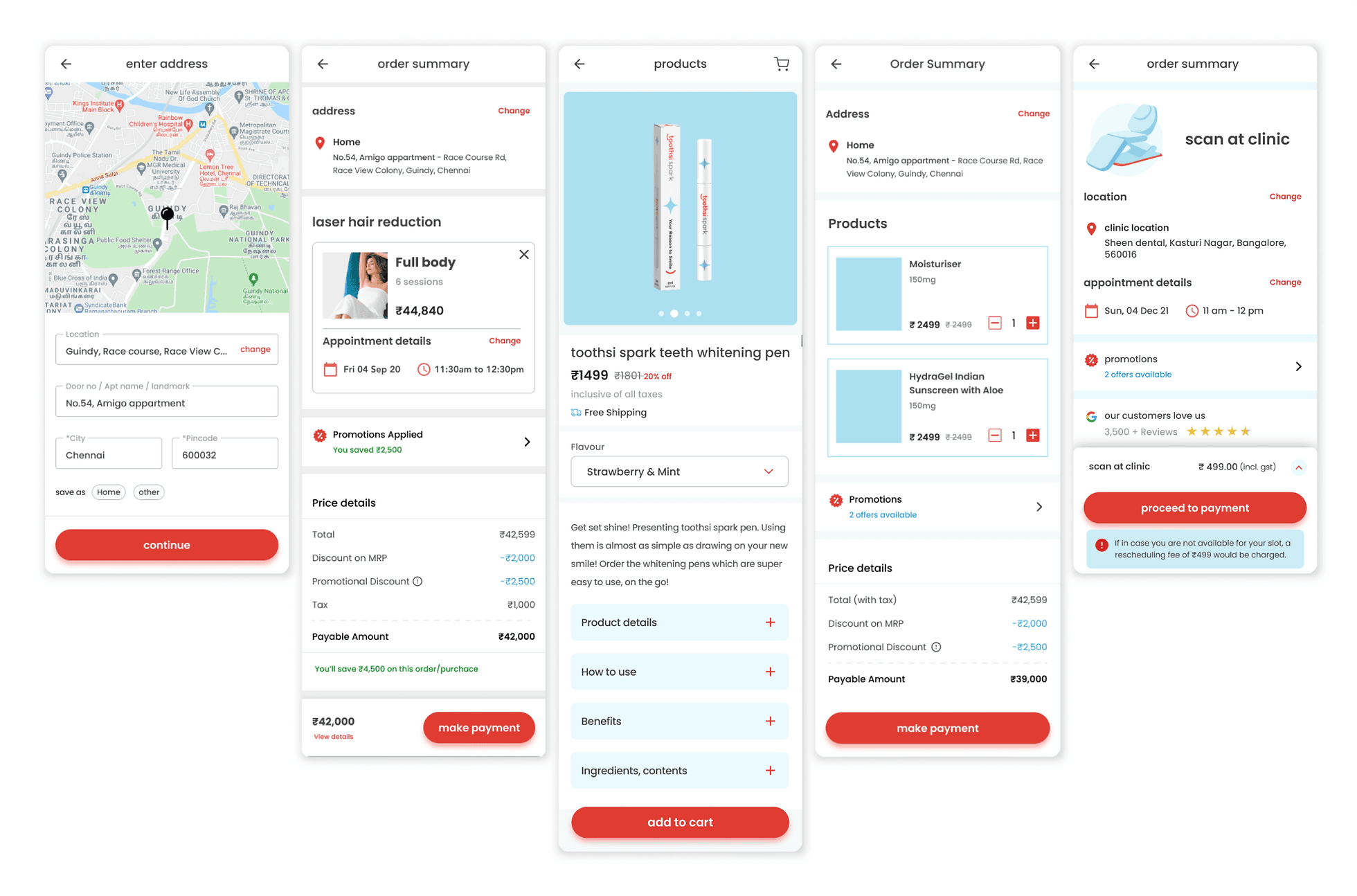
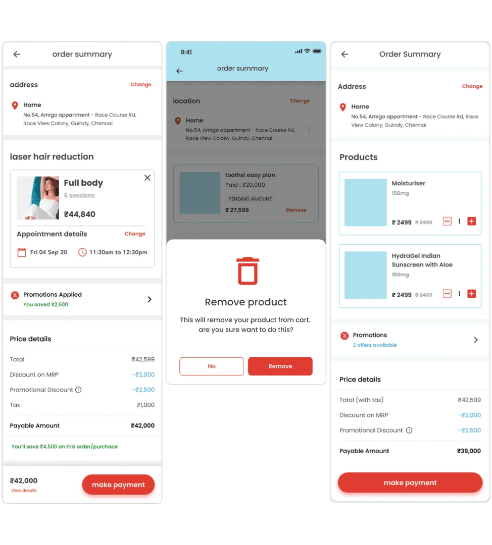
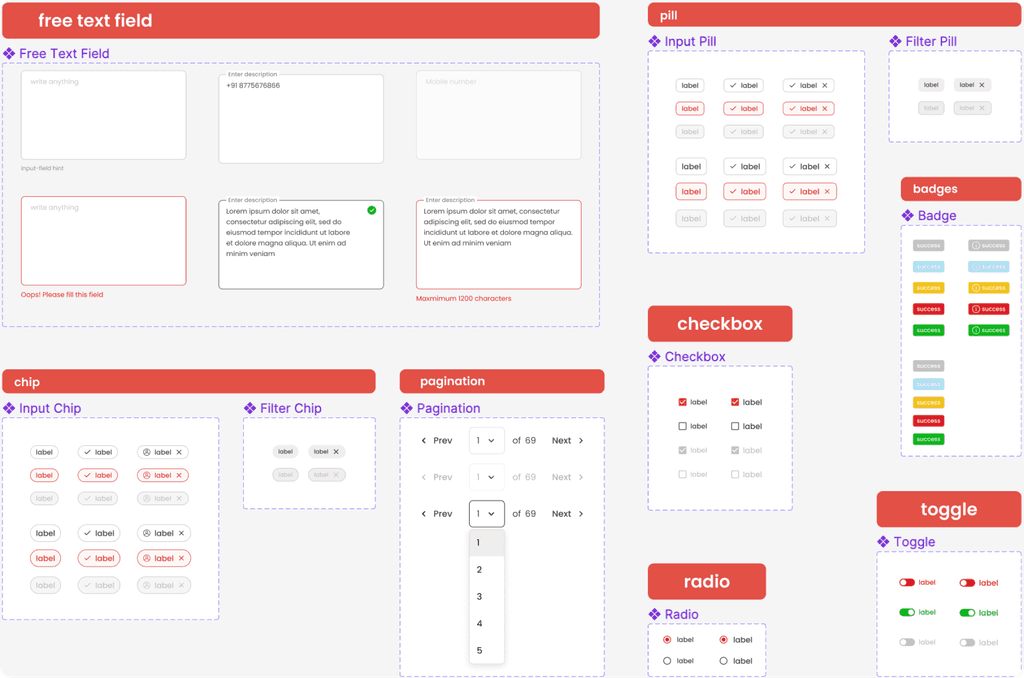
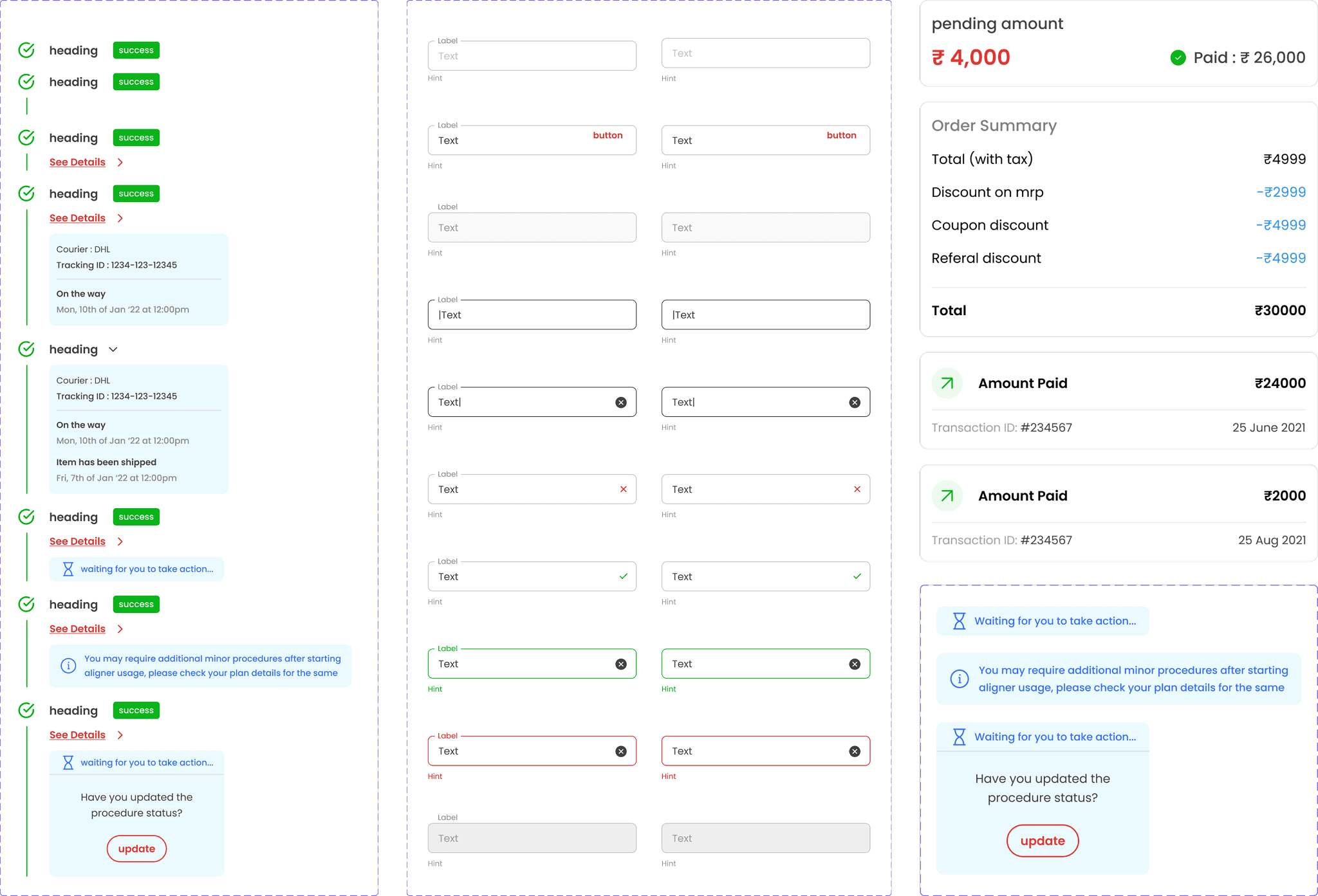
Component Library
Component Library
Component Library
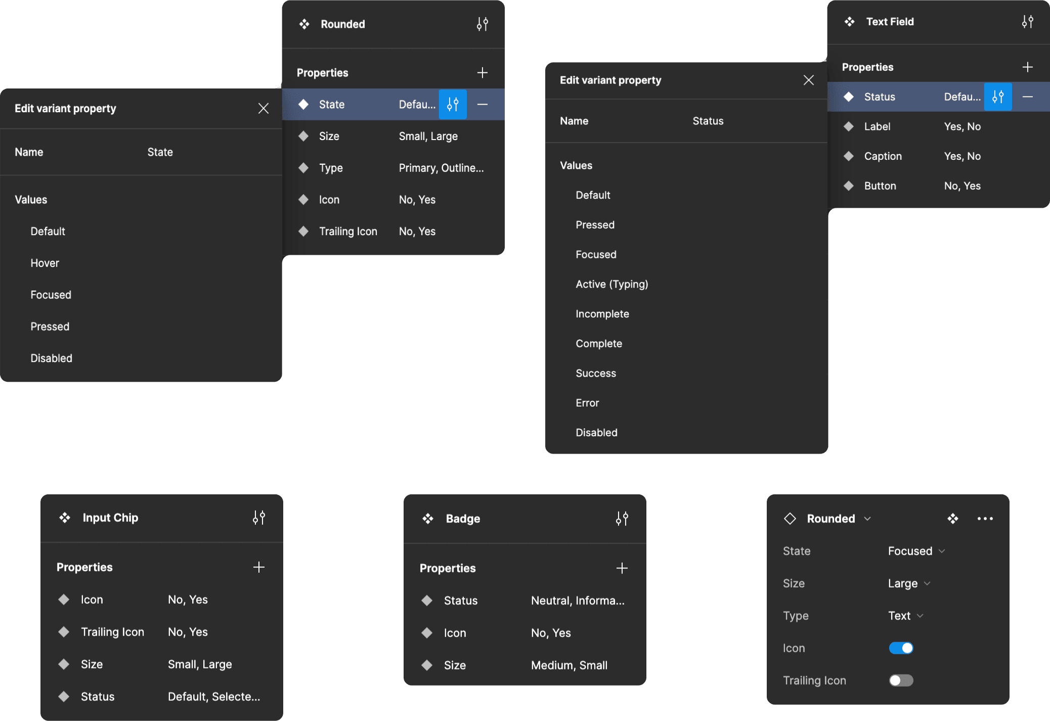
Building reusable, scalable and modular components was the most time consuming phase of this project. We also created corresponding design tokens to provide a common language for designers and developers to communicate and collaborate effectively during the implementation phase.
Building reusable, scalable and modular components was the most time consuming phase of this project. We also created corresponding design tokens to provide a common language for designers and developers to communicate and collaborate effectively during the implementation phase.
Building reusable, scalable and modular components was the most time consuming phase of this project. We also created corresponding design tokens to provide a common language for designers and developers to communicate and collaborate effectively during the implementation phase.
Defining Different States
Defining Different States
Each component was built for different states like default, hover, focused, pressed, active, error, etc and properties like sizes, icons, etc
Each component was built for different states like default, hover, focused, pressed, active, error, etc and properties like sizes, icons, etc
Documenting Properties & Use
Documenting Properties & Use
The properties of each component was thoroughly documented including descriptions and use cases
The properties of each component was thoroughly documented including descriptions and use cases
Creating Design Tokens
Creating Design Tokens
Semantic design tokens were defined to facilitate handoff to development
Semantic design tokens were defined to facilitate handoff to development
Slide to navigate
Looking back
Looking back
Throughout the project, our teams engaged in brainstorming sessions and regular check-ins set up via Jira. This fostered a culture of transparency, accountability, and shared ownership of the design system's evolution.
Throughout the project, our teams engaged in brainstorming sessions and regular check-ins set up via Jira. This fostered a culture of transparency, accountability, and shared ownership of the design system's evolution.